I have to tell you this story because it completely changed how I think about bathroom design. Last month, I was helping my cousin Jessica move into her new place, and she kept apologizing for how “boring” her bathroom was going to be. She’d chosen these simple beige tiles for everything : walls, floors, shower, the works. I’m thinking, oh no girl, what have you done? But then the installer finished, and I walked in there and literally stopped mid-sentence.
The whole space looked like it belonged in one of those expensive boutique hotels you see on Instagram. Everything flowed together so seamlessly, and there was this incredible sense of calm that washed over me the second I stepped inside. The light bounced off the walls in this soft, dreamy way, and even though it was technically just one tile repeated everywhere, it felt anything but boring. It felt expensive. It felt intentional. It felt like a spa retreat tucked into a regular suburban house.
That moment got me completely obsessed with the idea of neutral, one-tile bathrooms. I started noticing them everywhere : in fancy restaurants, boutique hotels, even in my yoga teacher’s renovated guest bathroom that everyone always compliments. There’s this whole world of sophisticated neutral design that I’d been totally overlooking, thinking neutral meant bland or safe or uninspired.
But here’s what I’ve learned after diving deep into this whole approach: using one neutral tile doesn’t limit your creativity, it actually forces you to get really thoughtful about texture, proportion, and those subtle details that separate amateur hour from professional design. Instead of relying on a bunch of different colors and patterns to create interest, you’re building depth through smart choices about finish, size, placement, and the way light plays across different surfaces.
My grandmother always used to say that the most elegant women were the ones who knew how to make simple look spectacular, and I think the same rule applies to bathrooms. When you strip away all the busy patterns and competing colors, what’s left has to be really, really good. Every line matters. Every texture choice counts. The proportions have to be spot-on because there’s nowhere to hide.
I’ve spent the last few weeks collecting ideas, visiting showrooms, stalking beautiful bathrooms online, and talking to anyone who’ll listen about their renovation choices. What I found are these nine approaches that take the simple concept of one neutral tile and turn it into something that looks like it cost way more than it actually did. Some of these ideas I’ve seen in person, others I’m dying to try myself, and a few are straight from conversations with friends who’ve nailed this look in their own homes.
Table of Contents
Embrace That Tone-on-Tone Life
My friend Sarah did something brilliant in her powder room that I’m still thinking about months later. She picked this gorgeous warm gray and used it absolutely everywhere, but she played with three different finishes of the same exact color. Matte on the walls, a subtle sheen on the floor, and these slightly textured accent pieces around the mirror that catch the light just enough to create visual interest without being flashy.
When you walk into that space, your brain registers this incredible sense of harmony, like everything belongs exactly where it is. There’s no jarring color transitions or busy patterns competing for attention. Just this beautiful, sophisticated flow that makes the tiny room feel way bigger and more expensive than it has any right to.
The approach reminds me of those perfectly curated Instagram feeds where everything is shot in the same light with the same filter, creating this cohesive visual story that’s more impactful than any single photo could be on its own. Except instead of overthinking it, you’re just picking one beautiful neutral family and letting the textures do all the talking.
What gets me excited about this approach is how it forces you to really pay attention to the details. When you can’t rely on bold colors to create drama, you start noticing how light moves across different surfaces, how a slightly rougher texture feels under your hand compared to a smooth one, how the subtle variations in a handmade-look tile create this organic, lived-in feeling that machine-perfect tiles can’t achieve.
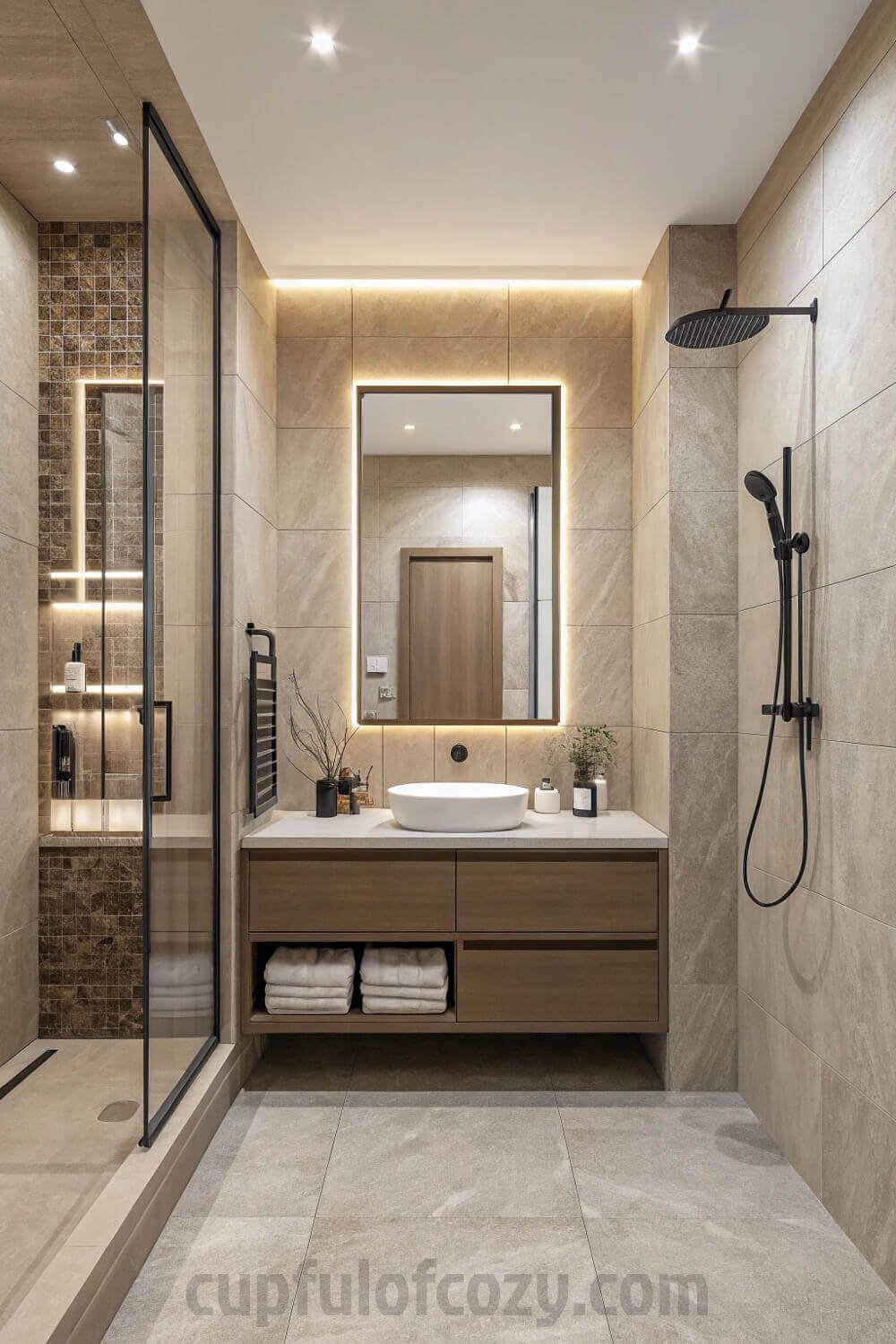
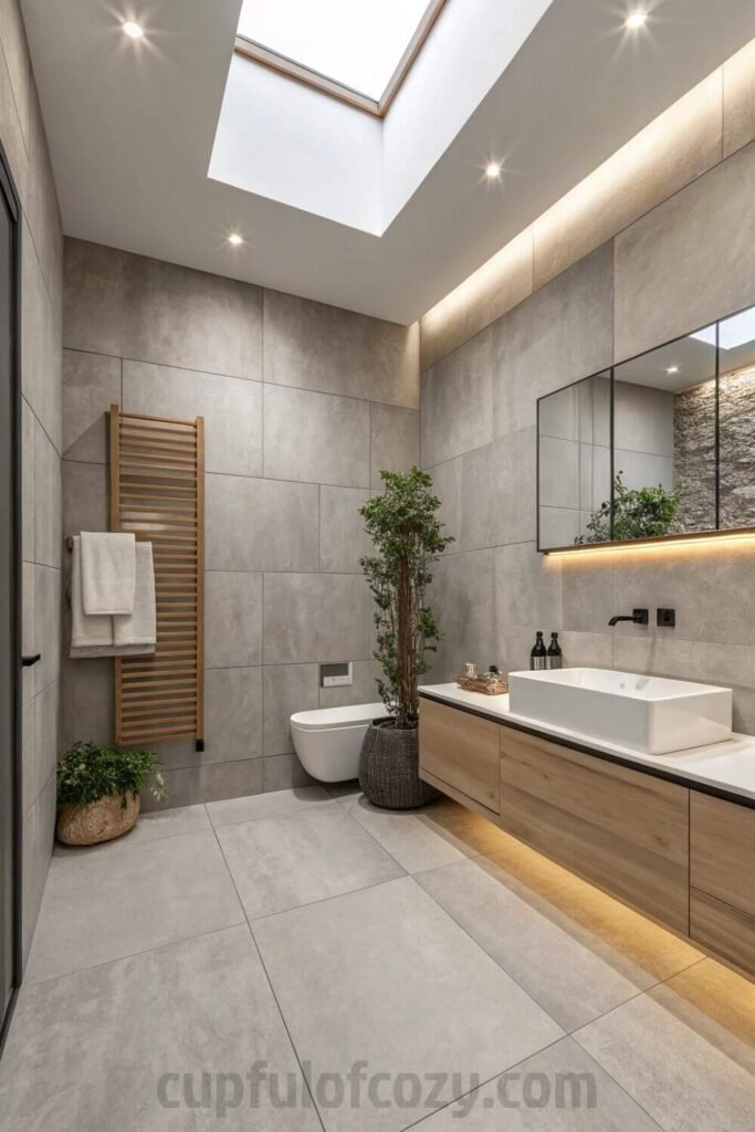
Go Big with Large Porcelain Slabs
The first time I saw floor-to-ceiling porcelain slabs in a bathroom, I was at this boutique hotel in Santa Fe, and I spent an embarrassing amount of time just running my hands along the walls trying to figure out where the seams were. The installer had done such a perfect job that it looked like the entire shower was carved from one massive piece of stone.
- Before you hit “buy” on your next decor order, there’s a free 10-second step you should never skip: checking Rakuten (Ebates). I simply find the store name, click the deal, and shop like normal, and Rakuten sends me real cashback! Prices keep climbing everywhere, but this is one way to get a little back on the things you were going to purchase anyway. New members even get a $30 bonus when they spend $30 — which means your first order could pay you back instantly. Don’t miss out again. Click here to sign up and save money!
*Disclosure: This post includes affiliate links. I may earn a small commission if you join Rakuten through my link — but it doesn’t cost you anything extra. In fact, you’ll actually save more!
Here’s what’s incredible about this approach: your eye isn’t constantly getting interrupted by grout lines and tile edges, so the space reads as this clean, unbroken surface that feels way more expensive than individual tiles could ever achieve. It’s like the difference between a perfectly tailored dress and one that’s obviously pieced together from different panels.
My contractor friend David always tells his clients that large-format tiles are one of the fastest ways to make a small bathroom feel bigger and more luxurious. The fewer lines your eye has to process, the more spacious and calm the whole room feels. Plus, with less grout to maintain, you’re basically buying yourself years of easier cleaning, which my lazy side absolutely appreciates.
The only downside is that installation has to be absolutely perfect because there’s nowhere to hide mistakes when you’re working with pieces that large. But when it’s done right, the effect is stunning. It’s like wrapping your bathroom in one continuous, beautiful surface that happens to be incredibly practical too.
Mix Different Shapes in the Same Color
This is where you can get playful without losing that sophisticated, pulled-together look. My sister Emma just finished her guest bathroom using this approach, and every single person who stays over comments on it. She used the same soft, warm gray in three different shapes: hexagon penny tiles for the shower floor, classic subway rectangles for most of the walls, and larger square tiles as an accent band around the middle of the room.
The genius of this approach is that your brain reads it as one cohesive color story, but your eye gets to follow all these interesting shapes and patterns that keep the space from feeling flat or boring. It’s like wearing a monochrome outfit with different textures : sophisticated and pulled-together, but with enough variety to keep things interesting.
What I love about Emma’s bathroom is how the different shapes create this subtle rhythm as you move through the space. The tiny hexagons feel almost like carpet under your feet in the shower, the subway tiles give you those clean horizontal lines that make the walls feel wider, and the accent band of squares breaks everything up just enough to feel intentional rather than accidental.
I’ve been sketching out ideas for my own bathroom renovation using this technique, playing with combinations like large rectangles and small squares, or mixing linear tiles with round penny tiles. The key is keeping the proportions balanced so no one element dominates, and making sure the scale works with your space.
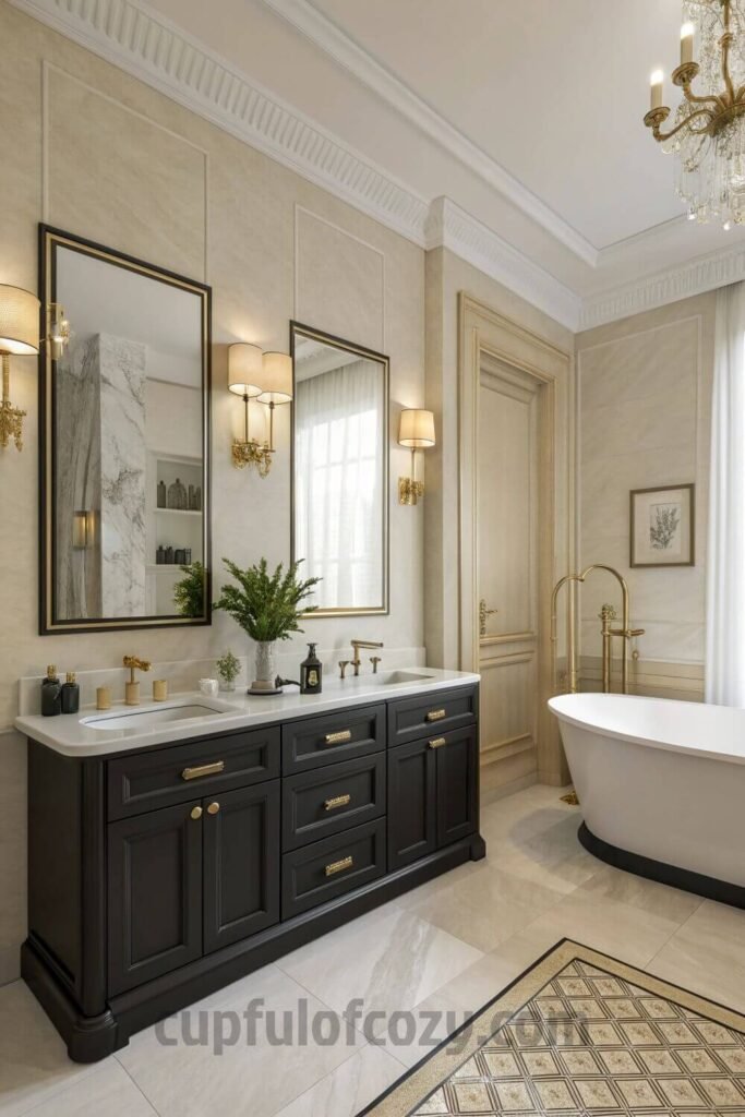
Frame Your Fixtures Like Artwork
You know how a simple photo can look completely different depending on what frame you put it in? The same principle works beautifully with bathroom fixtures. Using your chosen tile to create intentional frames around mirrors, shower niches, or even just the vanity area adds this custom, built-in look that screams expensive design.
I remember staying at this Airbnb in Sedona where the owner had used these beautiful cream-colored tiles to create a perfect rectangular frame around the bathroom mirror. It was such a small detail, but it made the mirror feel like it was always meant to be exactly there, rather than just hung on the wall as an afterthought.
The technique works especially well with larger format tiles because you can create clean, architectural lines without a bunch of busy grout lines cutting up your frame. I’ve seen it done around shower niches too, where the same tile that’s on the walls continues into the niche but creates this subtle recessed frame that highlights the space without adding visual clutter.
My cousin just did this around her floating vanity, using the same large gray tiles from the floor to create a backdrop that extends about six inches beyond the vanity on each side. It makes the whole vanity area feel like one intentional design element instead of just a cabinet that happens to be mounted on the wall.
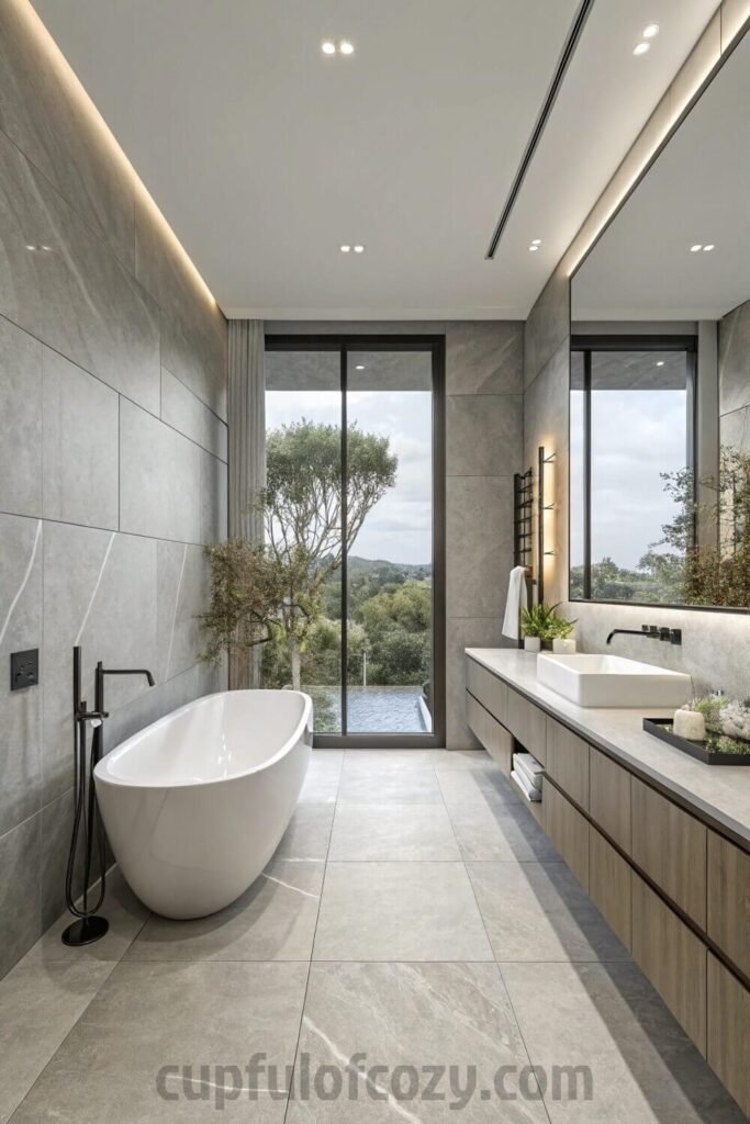
Bring the Floor Up the Walls
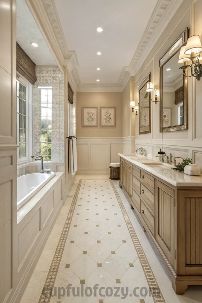
This technique gives me serious luxury hotel vibes every single time I see it done well. When you take your floor tile and run it partway up the walls, creating this tile wainscoting effect, it does something wonderful to the proportions of the room that I can never quite explain but always love.
My aunt Linda did this in her master bathroom renovation, using these gorgeous large-format concrete-look tiles on the floor and bringing them about three feet up all the walls before transitioning to a soft gray paint. The result is this beautiful sense of continuity that makes the whole room feel more spacious and intentionally designed.
What’s brilliant about this approach is how it grounds the space visually while also protecting the lower walls from water damage and wear. It’s pretty and practical, which is basically my dream combination for any design choice. Plus, it creates this natural horizon line that your eye follows around the room, making even a small bathroom feel more expansive.
I’ve been playing around with different heights for this technique in my head, wondering if going higher or lower would change the feeling of the space. From what I’ve observed, somewhere between 36 and 42 inches seems to hit that sweet spot where it feels intentional rather than arbitrary, but I’d love to experiment with it in my own space someday.
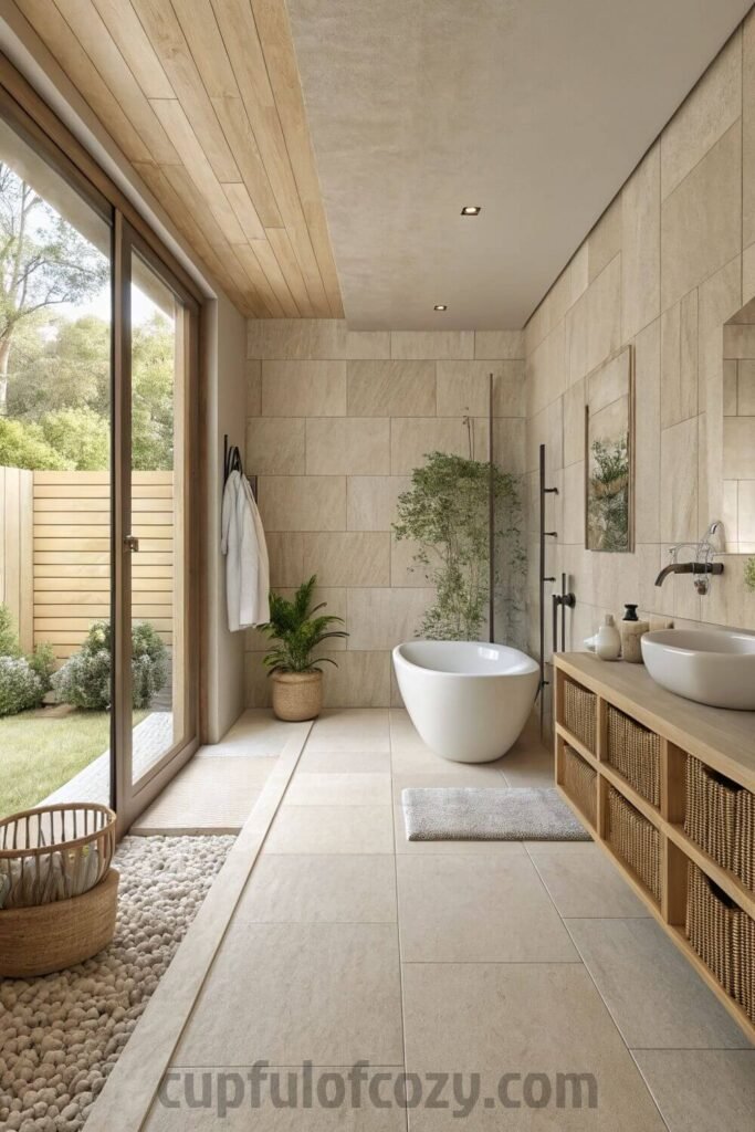
Add Natural Stone Texture
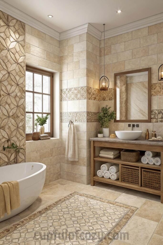
Even when you’re committed to the one-tile approach, you can still bring in that organic, spa-like feeling that makes a bathroom feel connected to nature. Natural stone textures or really convincing stone-look tiles add this incredible tactile quality that smooth surfaces just can’t achieve.
My yoga teacher Maya recently renovated her guest bathroom with these amazing travertine-look mosaic tiles in the softest gray I’ve ever seen. Every time I’m at her house, I find myself running my fingers along the walls because the texture is so beautiful and satisfying to touch. There’s something so grounding about those natural variations and subtle imperfections that makes the whole space feel calm and centered.
The beautiful thing about natural stone textures is how they change throughout the day as the light shifts. In the morning, Maya’s tiles look almost silver, but by evening they warm up to this gorgeous dove gray that feels completely different. It’s like having a bathroom that subtly changes its personality depending on the time of day and quality of light.
I’m drawn to limestone and travertine looks because they have this wonderful history written into their surface : all those tiny fossils and organic patterns that remind you these materials came from somewhere real and ancient. Even when it’s just a convincing porcelain interpretation, that connection to natural processes makes the space feel more grounded and less artificial.
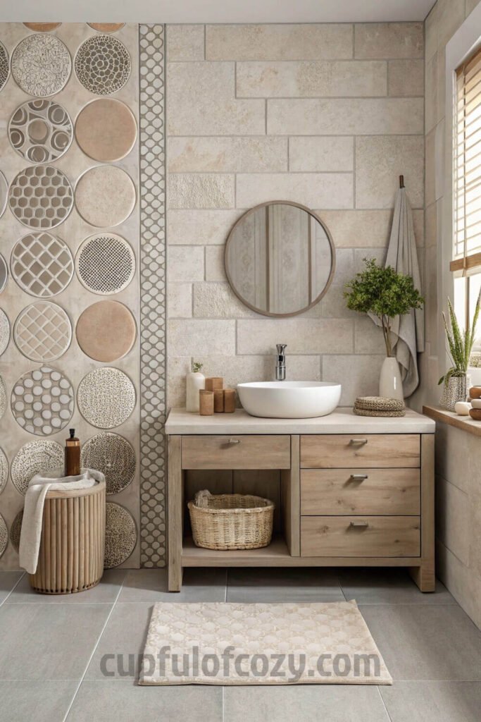
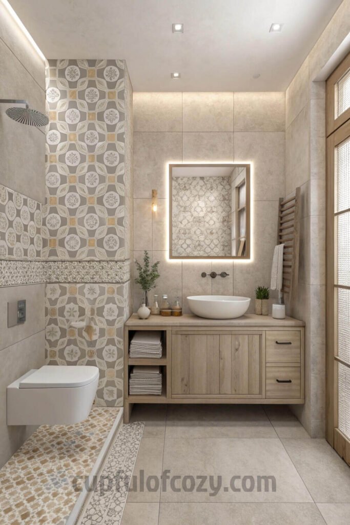
Play with Subtle Patterns
Who says neutral has to mean plain? Some of the most beautiful bathrooms I’ve encountered use patterned tiles in soft, muted colors that add personality without overwhelming the space. We’re talking delicate geometric motifs, hand-drawn florals, or subtle linear patterns, all executed in those dreamy beige and gray tones that make everything feel cohesive.
I fell completely in love with this approach when I discovered these hand-painted Moroccan-inspired tiles in a café bathroom in Portland. They were this incredibly soft, almost-gray beige with the tiniest bit of geometric pattern that you could barely make out until you got close. From far away, the wall read as solid color, but up close you could see all this beautiful handcrafted detail.
The trick with patterned neutral tiles is finding that sweet spot where the pattern adds interest without becoming busy or overwhelming. I’ve seen it done well with very subtle tone-on-tone designs where the pattern is created through texture or slight color variation rather than high contrast. It’s like adding a whisper of personality without shouting.
My friend Rachel just installed these gorgeous tiles with a barely-there linear pattern in her powder room, and the effect is so sophisticated. The pattern is subtle enough that it doesn’t compete with her beautiful brass fixtures, but interesting enough that you notice new details every time you’re in the space.
Choose Matte and Soft Finishes
There’s something so sophisticated about matte finishes in neutral tones that I’m having trouble finding the right words for. They don’t reflect light in that harsh, clinical way that can make a bathroom feel cold, and instead create this soft, almost velvety atmosphere that feels expensive and spa-like.
I’m completely obsessed with how matte porcelain tiles look in natural light. They have this incredible depth that changes throughout the day, catching light without throwing it back at you aggressively. My neighbor just installed these gorgeous honed stone-look tiles in matte charcoal, and her bathroom feels like a meditation retreat where you want to spend hours soaking in the tub.
The practical side of me also loves that matte finishes don’t show water spots and soap scum the way glossy tiles do, which means less maintenance and more time to actually enjoy your beautiful bathroom. It’s one of those design choices that looks amazing and makes your life easier, which is basically the holy grail of home improvement decisions.
What gets me most excited about matte finishes is how they create this sense of calm that’s hard to achieve with shinier surfaces. The light absorbs into the surface rather than bouncing off, creating this gentle, even glow that makes the whole room feel more peaceful and less visually busy.
Let Your Accessories Do the Talking
Here’s what I’ve learned about going neutral with your tile: it creates this perfect, quiet backdrop that lets your fixtures and hardware really shine. When you’re not competing with busy patterns or bold colors, even small details like faucet finishes and cabinet hardware become these beautiful focal points that can completely change the personality of your space.
My friend Maya paired these gorgeous warm-toned neutral tiles with the most incredible antique brass hardware, and it looks like something straight out of a design magazine. The neutral tiles let those metallic accents take center stage without any visual competition, creating this beautiful harmony between all the elements.
I’ve been playing around with different metal combinations in my head, thinking about how brushed brass would look against soft gray tiles, or how matte black fixtures might pop against creamy beige stone. Even chrome, which can sometimes feel cold, looks amazing against the right neutral backdrop because the warmth of the tile balances out the coolness of the metal.
The beauty of this approach is that you can completely change the feeling of your bathroom just by swapping out hardware and accessories, while the neutral tile backdrop stays classic and timeless. It’s like having a capsule wardrobe for your bathroom where everything works together, but you can still express different moods depending on your choices in the details.
Final Thoughts
The more I think about the one-tile approach, the more I appreciate how it forces you to really consider every single design decision. When you can’t rely on a variety of materials to create interest, you have to get thoughtful about texture, proportion, and those subtle details that separate amateur hour from professional design.
There’s something so calming about a bathroom that feels completely cohesive and intentional, like every surface was chosen to work in harmony with everything else. Instead of trying to coordinate a million different materials and hoping they’ll look good together, you’re creating depth and interest through smart design choices that feel effortless and sophisticated.
What I love most about these neutral, one-tile bathrooms is how they create this perfect backdrop for your daily routines. They’re beautiful enough to make you feel good every time you walk in, but calm enough that they don’t overwhelm your senses first thing in the morning or last thing at night. It’s luxury that works with real life, which is exactly what I want from any design choice in my home.
Related posts:
9 Genius Spa-Inspired Bathroom Counter Styling Fixes to Declutter
11 Spooky-cute Halloween-Themed Bathroom Shelf Decor with Beauty & Skincare Storage
How to Use Vintage Tile in Entryways, Mudrooms & Bathrooms for Stylish Impact
12 Beautiful LED Bathroom Vanity Lighting Options That Save Energy and Look Chic
- Before buying anything online, check Rakuten (formerly Ebates) — either with the browser extension or directly on Rakuten.com. Just type in your store, click the current deal, and shop as usual. Every purchase earns you cashback that can be mailed to you or sent via PayPal. In today’s economy, even a few dollars back can turn into a Starbucks latte, McDonald’s fries for the kids, or a little treat you don’t have to budget for. If you’ve never used Rakuten before, you’re missing out on free money — and right now, you’ll even get a $30 bonus when you spend your first $30. Click here to sign up and stop letting your online orders steal from you. Click here to sign up and save money!
*Disclosure: This post includes affiliate links. I may earn a small commission if you join Rakuten through my link — but it doesn’t cost you anything extra. In fact, you’ll actually save more!